


How Effective is the Combination Of Your Main product and Ancillary Texts
The combination of the of are teaser and poster is very effective because in the teaser all the audience knows is that a virus spread out and infected everyone except our Hero who may be the only living person in the world....Or Is he. On the poster the hero has a half human face and Half zombie face which gives the audience the impression that the character on the poster either turns into a zombie or has to fight zombies to survive. i


found this very effective because i felt that this helped the audience see different aspects of the films story-line, such as if the audience hadn’t had seen the trailer but seen the poster they will think the film is just about zombies however if someone saw the teaser and not the poster they will think it is just about someone who is all alone in the world. this i thought worked well because i wanted the public to want to see the whole thing and not just the trailer or poster because this will help them get a better understanding of the film. i thought with the magazine front cover of and Poster this will make the audience to be intrigued and help boost the popularity of the film itself. with the trailer this will; be the icing on the cake for the audience and letting them see a snippet of the final product and its visuals. with the Word of Mouth and mouse campaign the would help boost the product in terms of sales and popularity, as-well as the use of the zombie image would also attract more fan of the Horror genre and without any known actors would make it seem more realistic and not alot spent on the budget would’ve been spent.. I didn't show alot of zombies in the the trailer because i didn't want to give to much of the story-line away before the audience could tell what the plot-line id and become uninterested. i did alot of planning and asked different people what they would want to see in the poster and trailer. i also looked at the teaser trailers of the movies 28 days land I am legend where i got my initial idea that there is know one left on earth, i thought these helped because i took an idea from another film and made it into an original idea. i also looked at the poster of the walking dead and interpreted the idea here there isn't anyone-else. With my tag line The Last Man on Earth Is not Alone is effective because it fits in with what the film is about and also pays homage to other movies which are about people being alone such as I am legend. in the magazine there are interviews and pictures of the set and Actor, this will get the audience interest and would want to purchase the magazine, and when people see it has been put on known Magazine EMPIRE they would automatically want to see it since it is a popular magazine known for its reviews of high rated films.
What Have You Learned From The Audience Feedback
TO get the Audience more involved with the project i shot a couple of interviews and questionnaires so that i could find out what the target audience would like to see in a horror trailer. with the responses i found out that people would like to see less blood and death in the trailer because they would like to see all of it in the film. also the ages to go see a Horror film were 15- 33 year old which i thought was useful information because it will help me classify what audience i would like to go see the film. i also found their feedback for my poster useful because at first my initial idea for the poster was zombies crowding over a dead body, but the audience found that squeamish and felt uncomfortable with it because they easy they also didn’t like too much of the story was given away. so i revamped the idea and changed it to half human and half zombie
because it seemed more effective and was what the audience’s wanted. i showed the first ten people who purchased my magazine a chance to get a sneak preview of clips of the films and the unfinished version of the trailer and got alot of positive feedback. they liked the fact that it wasn't a typical horror that followed a linear narrative but that it is a survival horror film which has a lot of twists and turn which make it one of the most exciting films of the year. what makes the film different is that it doesn't aim for fear that you can see but fear of the mind and fear of being alone. What is more scary than being alone for the rest of your life with know one around. thats the point i wanted to get across with the film and most of the audience ran out of the screening because it had affected them sub consciously, this is why my film could win Scariest film of the year. what made the trailer successful was what the audiences asked when i gave out my questionnaires and these were quick shots because they wanted to see alot of action but not for long because they didn't want the story to be ruined, they also wanted a slow shot at the beginning which i made the establishing shot to show off the hero and his location. I also added a voiceover which i thought was typical in trailers just to give the audience more of the story line and what it is about. alot of the audiences commented on the editing and the use of various effects such as quick shots,m Freeze Frames, mid shots and voiceovers. they all agreed that these things made the trailer very effective and interesting. the audience also liked the font i used and the different captions i used for my Magazine front cover, they liked how i included interviews and at top 40 list of Horrors of the 21st century, they thought this was effective because it gave the impression that this was a genuine magazine and not just a cheap excuse for a magazine. the magazine caught the attention of the audiences because of its Font which was large and eye catching and ‘Very Colorful was one of the responses i got’
The font itself was very effective because it highlights the darkness of the film and i gave it a kind of see through look to highlight the hero was all alone in the world and gave it a black background to show that he is alone and that something evil is lurking in the shadows. the audience agreed with this technique because it is a chance for them too look deeper into the text and reveal the secrets and reasons why are did things the way they were and not just as a cheap imitation of a cover. I looked on Pearl and Dean and looked at similar Horror films that are compared to mine and found out that most of the films are share a similar linear story line, which is Some is in the world alone, he finds survivors and then they fight and unknown life form and then it ends with them together. i made my story line different and broke off from the linear-ness of such story lines and made my story line about a boy who is alone and thinks he is alone but is actually being watched by a government association who are putting bets on his life where he lives or not. I got very positive feedback when i first explained this to the audience to see what reception i would get and i got some very positive feedback and they said they liked my originality.


for those who enjoy those films, the challenge of being frightened (as someone said) in a safe environment


 and one was torturing the other. Colour is used heavily in the scene because as you can see one of them has pink and is wearing al white as if she was a good person, somehow angelic whereas the other his wearing all black attire and has gold fangs which could suggest that she could be the monster they are referring to in the song and also the monster that may eat the victim she has tied to a chair. and this gave me the idea that i could use the clone effect and make it look like i was a ghost.


My first initial idea for a horror teaser trailer was to have it in game like form, I thought of this idea while playing a survival horror game called Silent Hill, I looked at the trailers for it and saw that the game trailers were no different from a normal movie trailer, and the effect the game had on people would even be more frightening because the person is actually playing the game and not watching it. I looked at other movies such as stay alive which had the same sort of idea that I was thinking of, which was all these gamers come from around the world and all of Play To Survive. Literally, this was also going to be more slogan or catchphrase if you will to catch the audience’s attention. At first I was going to have the players all have avatars and have a couple of the avatars die but I thought because of copyright issues this wouldn’t work. So I planned that I would instead of filming my actors avatars dying I would film their reactions which would show their audience that they were dead in the game. This I thought would be very effective because I would be able to avoid copyright issues, but since I had planned to shoot the trailer in different locations I thought quick cutting of different reactions would somehow confuse the audience so I went back to the drawing board and watched a film called Fermats room
 this was a Spanish film about these mathematicians called into a room and given 1 minute to answer questions before the room closes on them, I took this idea and planned on translating it to fit in with my storyline because it seemed like it would’ve worked well, and everybody in a room together would seem more efficient because it would tend to make the audiences feel more vulnerable. I created a menu button and a game over sign using flash; this was to show the audiences snippets of the game so that they can be more interested in watching the trailer, and I also created some effects using adobe after effects to give the trailer a game like feel to the clips. I saw this idea from film Scott Pilgrim Versus the world.
 This was film heavily influenced by games and I wanted to take the same game concept and make it into a horror. When it came to storyboarding it that’s when the difficulties came about because I realized that there weren’t any shots that can be fully explored in a little to room. This is when I changed the idea to something that I thought would be effective.
CREATING THE MUSIC
 where I created different soundtracks and picked which one I would like to use for my teaser, since I had already had some previous experience in using it, it wasn’t difficult for me to use because I had already figured out the layout of my music and how I wanted it to sound,
 Since my teaser is about a very dark villain which is also the devil I wanted it to be dark and eerie so that the audience would feel scared an vulnerable. I also added a ticking sound to the beat because it is normal to hear slow clicking sounds to horrors and it seemed scary as well, I was also referencing one of my favorite horror films Planet Terror where a clicking sound can also be heard.
 Since Fruit Loops had presets such as a drum kit and piano making the music didn’t take as I thought it would be and I felt it was much simpler than using Garage Band which I had a slight difficulty in using when I was creating my Opening to a thriller. I also had an audience of other beat makers which helped me decide which beat I should use for my trailer and what they thought was more effective to give off that dark feeling that everybody would be anticipating when they finally get to see my horror trailer.


 1890's-1920 (Phantom of the opera)
 1930's-1940's Frankenstein
 1950-1960s Night Of the living Dead
 1990's Chucky
 2000's
 The Title of the Poster is red Because this symbolizes blood and action. this suggests the film will be action packed and will have a lot of blood. It is also red because the colour is bright and eye catching drawing more audiences in to come see what is on the cover.
Inception is red because it is also attracting audiences in and wanting them to have a look at the colour, which is why the text is big and not the same size as the other titles because this film is the star of the show.
Leonardo Dicaprio is on the front cover because he is an A list actor and a Known face with the fans, which would make the magazine sell aswell. he is Holding a gun suggesting the film is an action film and he is also wearing a suit suggesting that the film has aspects of Being a Spy.
The headline ‘The Matrix meets 007 on Steriods’ is is Capital letters because the publishers want to express how epic the film is and is also attracting fans of 007 and the matrix.
The film is about dreams so the publishers of the magazine added a cheap slogan ‘Dream Acess’ just to bring in more audiences to watch the film.
There are Bold text’s all around hilighting the other films and BATMAN 3 is next to the Image of leonardo since its both Nolans films.
THOR is on the other side of Batman 3 because both films are from rival comic book company. this is effective because the magazine are starting a little comic book war.
A city can be seen behind leornardo suggesting that the film is set in a large area

There is more action in the trailer than the teaser and more dialogue such as a voiceover which gives the audience more of an insight about what the film is about. also more effects are shown and the scope of the film such as monsters fighting and sword fights and also the montage of clips shown in the teaser trailer. there isn't really any music played except the diegetic soundtrack used which is of the band playing their songs this suggests that Scott is in a band and could possibly use the instruments to fight off his enemies. also sound effects from games like Mario and Zelda are used in the trailer this could also suggest that the film relies heavily on the use of games. the voice used is a typical voice which is used for comedies, this gives the audience the impression that the film has comedic attributes to it or it may just be an all out comedy with action in it. like the teaser trailer the trailer speed starts off slow showing a bit of the story line and introducing the characters but then the trailer speeds up to show action, however this sis similar to the film though film will have more scenes and more time to for the film to build. Like the teaser the trailer is aimed at the people who enjoy action/comedies also people who have played games like mario and lived through the MTV
age.

We are told the name of the film at the end of the trailer, this is because the producers wanted the audience to watch the whole trailer and get into it instead of them seeing the tittle and just not bothering about it anymore. they wanted the audiences to watch the whole thing.
Like the teaser trailer we aren't told who is starring in the film because there aren't any known faces in the film, this is because the director wanted to give a more realistic feel to the film so using actors that aren't known makes the audience connect more with the characters.

We see alot of action throughout the trailer such as gunfire blood, possessed people, fire, most of these are conventions of a horror and suggests that the film is a horror with action conventions in it.

The music used is dark and eerie which gives off the impression that the film is horror and it also fast paced suggesting the film will be upbeat and quick.
There is a voice over at the end of the trailer talking about how scary the film is. the voice is used because it is a known voice for doing horror generic films and this is the impression the director wanted to give the audiences that this is a genuine horror film.
In the trailer the speed alters and it is very quick showing a variety of quick shots to show the audiences the action that it has on offer whereas in a clip it would start off slow this is because it is showing the audiences a bit of the narrative and story line.
We are told bits of the sotryline which are told by the action we see on screen and through captions that pop up throughout the trailer. what we find out is that the police were sent to contain a virus but it got out of hand and now they are locked in the building and documenting what’s happening .
The trailer is aimed at people who are fans of the real life horror genre who enjoy blood and gore
We are told the name of the film at the end of the trailer like the teaser this is because the director wanted the audience to be more interested in the trailer.
We aren't told who is starring in the film but the trailer relies on the audiences knowledge of actors to see if they can spot who it is and the actor starring in the film is Timothy Olyphant who is known for starring in big budget film such as The Transformers Franchise. The information is given to us in a montage of shots showing us different scenes with actor in them, and the establishing shot shows the actor which suggests the audiences that he is the Hero in the film.
The music used is a song called Mad World which gives the audience a hint of what the film is about which is about people in a small town becoming mad because of the polluted water.
We see alot of action in the film such as gunfire and darkness which suggest the film is an action horror.
The speed of the trailer starts off slow to establish the where they are and the characters’ , then it starts to speed up as the audience start to understand what’s going on and then it becomes fast because the director wanted to show different scenes and what type of action it has to offer. the audience for this is aimed at people who are fans of the main actor Timothy Olyphant and also fans of the action horror genre.

We aren't told who is starring in the film though the trailer does rely on the audiences knowledge of A list actors such as Michael Cera who featured in Superbad and Jason Shawrtz. though the trailer tells you that the person who made the film was the director of HOT FUZZ and Shaun of the dead which british Audiences Know that would be Edgar Wright. American Audiences will be comfortable with the cast because of the American actors used and a fun Fact was Edgar wright chose to use American because all his previous movies have only used British audiences.

The information about the director is shown in bright lights and a big font of what movies he has made which would help the audience become more enticed with the film. the Bright lights used when showing the director highlights the lighting in the trailer which is very bright and orange at times.

We see alot of action from the trailer since its an action film, the type of Action we see are Sword fights, Hand to Hand combat and guitar fights. what makes this film different is that its is postmodern and incorporates video game and comic book references in the film, such as the sound effects from games like Zelda or when he gets it words like BAM or SMACK can be seen. Also when he is fighting a VS bar appears which shows its video game like appearance.


The Music starts off slows as if it was a typical romance then the equilibrium is disrupted when Scott gets punched and a montage of shots of him getting beaten up and the music changes and becomes more fast paced to coincide with theaction taking place. the music then suggests the movie will have a bit of romance but its an all out action film.
The voice over that is used is heard at the end of the film telling the audiences of the title of the film, audience would have mostly heard the voice in comedic movies which means that the film would have some comedic moments in it.


The speed of the trailer is much faster than watching a film because the distributors want the audiences to see alot of action so they can be more engaged into watching the film, however when watching a clip its much more slower because of the dialogue in the scene and the actions the actors are doing which gives more insight about what the film is about rather than a random montage of shots and the audience may not understand what the film is about.
At the beginning of the trailer it was very slow because it was showing Scott building up a relationship with the girl but then it alters when he is shown fighting random people in different scenarios which livens up the trailer and makes it more fast paced
The trailer is aimed at Teen Audiences since the cast appeal to a Younger generation and also appeals to the people who are interested in Video games and Comicbook since the film is based on a comicbook and uses videogames references through out the trailer.

We aren't told who is starring in the film because none of the cast are A list actors, the reason why the director didn't have any known faces in it is because he wants the film to have a more real look and feel to it other than Known faces playing Superficial roles.

However we re told who produced the film which was Filmax who are known for distributing non-english films. the information is given to us at the beginning of the trailer informing audiences of already of the production team behind it.


We see alot of action such as Zombies, Gunfire, Blood, Death which are all typical conventions of a Horror film except the gunfire which suggests the film has aspects of Action in it. the movie is shown in a first person view which is quite strange for a horror because typical horror films told in 3rd person, however with the 1st person view mode makes it more real and up close.
The music used sounds like it is Spanish would could suggest the movie is set in Spain, also it sounds like it was a soundtrack from an Opera which could also mean the setting is in an Opera house. the music starts off slow establishing the characters and setting of the film. the music then starts to speed up as Zombies attack the police officers, this suggests that the film will start slow then speeds up as it progresses.
The speed of the trailer is very fast paced and quick and shows a variety of quick shots and only action is shown only because the producers would like to give the audience what they want to see if they are looking to watch a horror movie.
We aren't given that much Information but what we do see is a group of Police officers going into a quarantined building where they don't no what to expect then they are attacked by a group of bloodied people who we then assume are zombies, we are then shown different shots of random things such as a bible, a child , crosses which tells the audiences that the movie my include biblical references.
The Type of audience are for people who like zombies gun and don't mind watching the film in a 1st person view.

We are told the title of the movie at the ending of the trailer in a Voiceover, this is because the director wants the audience to have a look at what they have to advertise before letting the audience know what the film is going to be called.

We aren't told who is starring in the film but we are shown a known actor which is Timothy Olyphant who is known for starring in Action/Horror films.
We are shown alot of action such as Gunfire, Death, Possessed people and Blood.
The trailer doesn't play any Music but relies on the sound such as the gunfire to give the audience a Vague image of what the film is about.
The speed of the trailer is very Fast only giving us glimpses of the action thats going on, this is because the director only wanted to show the audiences snippets of what it has to offer so that the audience can research more and possibly go see the ilm in cinemas.
The information we are given about the film is that the government are killing people because they are possessed but now they are killing everyone and planning to wipe off the entire town.
This info was given to us during a snippet of dialogue that could be heard in the trailer.
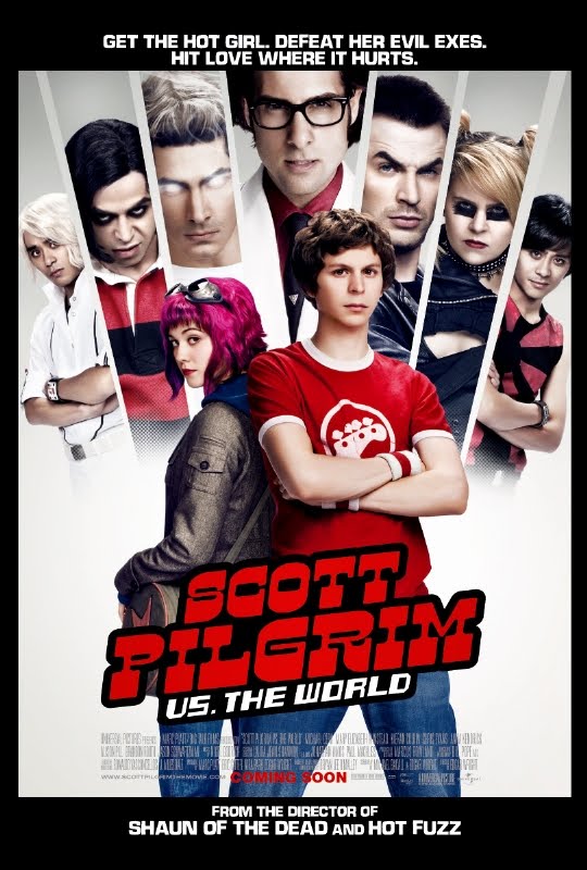 POSTER ANALYSIS
The main colour's used in the poster are red and white, the hero which is the boy is wearing a red t-shirt with white on it, this could represent that he is violent but has a soft side in him. the symbols used are on the boys t-shirt their is a picture of a guitar n it which could mean that he is a musician, also the girl has glasses which are on her head which could mean she is a traveler. also the way they typed in SCOTT PILGRIM looks like in gaming form which could mean the film has something to do about games. there is a person with white who which could mean that he has supernatural powers. their is a girl on the screen and she is part of the exe's so this could mean that she is a lesbian. also there is a man in the middle wearing a sit which could mean that he is the girls last ex boyfriend and probably the most important. the messages in the poster are verbal and visual because the catch phrase Defeat her Evil Exe's and you can see what the exe's look like. this tells the audience about the characters and what they look like, also shows them if they have powers. i think the intended audience for this film is teens because it incorporates gaming and comic conventions in the film.
I think the persuasive techniques used in the film is the cast because it has alot of known faces in it such as Michael Cera who was in Superbad, also mary elizabeth winsted who was in Die hard 4. also another known faces in it is jason Schawrtz and the guy from fantastic four. also i think the movies main selling point aswell is its title because it will also bring in the people who loved reading the comic books. genre conventions that are refereed to are romance- his love for the girl, Action-he has to defeat her evil exe's. The only expert witness used is when we are told that the person who made the film is the director of shaun of Defeat black which could mean he is the evil one which could mean that they could be Ying and Yang. Everybody in the poster seems to be folding their arms except from the guy in the middle which could suggest that he is the Boss. The tagline works in a typical superhero type saying Defeat the Exe's, Save the Girl. Hit it where Love hurts, its ok and works however it is not very original since a saying like that has been used many times such Save the world and Get the girl.
The poster constraints says alot about the movie’s budget because on the poster alot of known figures such as Michael Cera, Jason Shwartz and mark webber which means that they are not holding any barriers for an Allstar Cast, and this is shown with its budget of 85 million and 38 million went to the cast and rights to the film while another 30 million went to the Production of the movie.
the Hierarchies such as the on the poster they have the tagline is first which shows that that is one of the most important selling points in the poster. Also since you can only see half of the bodies of the seven exe's and the full body of Scott pilgrim shows that he is most superior out of everyone and also shows that he will be the hero. Before the introduction of the internet posters played a large part in the advertising of film because they were put all around the area to advertise the films but since with he internet and the use of mobile phones, social networking such as twitter posters are having to be less used.
The Poster is effective because it gives the audience an insight on the film and the characters, it also shows the actors in the movie and what their roles would be.
it communicates with the required audience teens because the cast are are mostly in their early 20’s and fans of the comic book will be happy to see all the characters they like appear

The Decent
The main colors in this poster are black, grey, white and a small amount of red. 75 percent of the poster is black which gives the audience a sense of mystery. The grey, white and red are in the same color pallet when we think of colors signifying horror.
The title of the film is in white this is to make the title stand out we can see the heavy contrast between the black and the white however all of the text on this page is white this symbolizes innocence and something clear however as this is a horror film poster it is most likely its the opposite.
The main object we see is a woman in the bottom left corner her head is tilted however her eyes are facing directly at the audience which pulls the audience attention. She looks like she has blood her head this could be from abuse throughout the film this signifies that violence will be in it. There is light shining down onto her, if that light weren't there we wouldn't be able to see her, this suggests that she is one of the main characters that could have escaped. This is shown through photography. The messages in the poster are shown through pictures as there is no text to hint of what is in store.
I think the intended audience based on this poster is an 15 this because there is blood on her which suggests violence and gore.
The tag-line reads 'face your deepest gear' judging by the tag-line and the pictures shown a fear could be of the dark. The conventions of this poster are all horror conventions for example a woman has been used on the poster this is a stereotype as woman are shown as weak and vulnerable. There are character named used on the poster this is because there are no big names however if there was they would be exaggerated to gain the audience's attention. There is a critic giving there view of the film on the poster it says 'outright terror, bold and brilliant' I cannot see who said that as the text is too small. Attention is gained through shock and horror the woman looks scary which draws our attention to her.
I think the poster is excellent as it is simple yet it gives you a lot to talk about and think about. However there could be a bit more information about the film.
Prom Night
I have chosen to analysis 'Prom Night' horror poster. This poster is very effective yet very simple.
Firstly I can see there are four different colors these are, red, black, grey and white. These are the main colors associated with horror. They make the poster more effective by adding colorful elements as they attract the audience attention yet it doesn't distract them too much away from the main image. The red in the title signifies horror, gore and blood. It makes it stand out against the dark background with out again distracting the audience away from the main image. The top of the title has a blur which goes upwards which can look like blood that has been dripping. This establishes the genre to the target audience by showing that they're will most properly be violence, gore and blood throughout the film.
The main image is of a character which looks like she's screaming, she has a tiara on which is the main focus point. It can be said that the poster uses juxtaposition by using something glamorous within a horror poster. The tiara symbolizes the stereotypical element of school which then connotes with title which gives the audience an idea where the film is most likely set. The character seems to be in distress we can see this by her facial expressions, her hair is messy and her tiara isn't on properly. Which again we see the use of juxtaposition where her hair should be tidy because it is prom night but it's not, due to horror and torment she has most properly received. Her tiara and her hair cover her eyes which gives the poster a mysterious feel to it, also because her eyes are covered the audience are drawn to her mouth where we see fear in her expression. the mouth takes up a third of the poster which highlights the importance of it, also we can almost feel her screaming due to the size of the picture.
The poster overall looks like its damaged due to scratches. This can reflect the possible struggle the character has been through.
We can see that the tag-line is 'A NIGHT TO DIE FOR', this is a play on word as the target audience are most likely to use this phrase however to word 'die' suggests that this that it will actually happen in the film. The tag-line is positioned underneath the title so it's the second thing the audience reads. The color of the phrase is white which can symbolize innocence which is actually the complete opposite, the tag-line stands out.
Underneath the title and the tag-line we see the words 'In Theaters this spring' which suggests that this is a teaser poster as they do not yet know when the film will be out. Because of this it captures the audience into wanting to find out more about the film as it's only a teaser whereas a theatrical poster will have more information.
The poster has no names into who is starring in the film this could be because they're are no big popular names in the film. If the poster were to have big names in it the names would be exaggerated highly so it attracts the audience's attention and will make them want to see it more. The poster has most of the conventions of a thriller we see this as the character is a female and she is screaming. They use females and the gender is stereotyped to be the weakest and more vunerable to the actions of the villain.
